
A contact form that encourages people to get in touch
Which fields should you include, how can you reassure visitors and check messages arrive? Create a contact form that makes requesting a quote easy.
Sur cette page5 sections
Imagine this: someone discovers your website between appointments. They’re interested in your work, click on “Contact” and start telling you about their project. Then the form asks for their full address, their budget, an exact date and three other details they don’t have to hand. They decide to come back later. Maybe they will. Maybe they won’t.
On the other hand, a message that simply says “Hello, I’d like a quote” will leave you having to ask every question one by one. The right form sits somewhere in between: it makes the first contact easy while giving you enough information to provide a helpful reply.
Before choosing the fields, think about what happens next
It’s tempting to use the form to ask everything at once. That makes sense: the more complete the enquiry, the less back-and-forth there will be. But every question takes effort from the visitor. If you don’t need the answer before the first conversation, it can often wait.
I recommend starting with what you do when an enquiry comes in. What do you need to know whether you can help and get back in touch? For many quote requests, a few basics are enough:
- a name and a way to reply, usually an email address;
- the type of service or a description of what’s needed;
- the town or area involved if you need to travel;
- a phone number if a call would be useful.
A preferred date, measurements, photos or a budget can help, but not everything needs to be compulsory. A tradesperson may need to see where the work will take place; a freelancer is more likely to need an understanding of the project’s objective. For a restaurant, direct booking will often be more suitable than a quote form. The form can still be available for groups, events or catering.
Suggested options help people find their way quickly, as long as there’s room for projects that don’t fit neatly into the available categories. And if you need more details later, you can ask for them during the conversation.
Reassure people before they send
A visitor won’t necessarily know what happens after they click. Will their message reach someone? Will they receive a call? A reply tomorrow or in three weeks? A few words near the form can clear up these doubts: say which areas you cover, your usual response time if you can reliably meet it, or how you’ll get back in touch.
Labels matter too. “Tell us about your project” is more welcoming than a field whose purpose isn’t clear. Make it obvious which information is genuinely required, without turning the form into an administrative questionnaire.
When it comes to personal data, ask for what you actually need to handle the enquiry and make privacy information easy to find. A tick box isn’t a magic solution: consent is one of several legal bases, and the right one depends on how the data is used. If you also want to use contact details for marketing, clearly separate that purpose from the contact enquiry. The CNIL, France’s data protection authority, explains data minimisation and the conditions for consent.
On a phone, test it with one finger
A form that looks simple on your computer can become frustrating on a phone: a field that’s too small, a keyboard unsuited to entering an email address, a button that’s hard to find or an error shown at the very top of the page.
Keep labels visible while people type. An example shown only inside a field disappears as soon as someone starts typing; if they come back to correct their answer, they may no longer know what they were supposed to enter. If there’s an error, explain what needs correcting next to the field: “Enter a valid email address” is more helpful than “Invalid field”.
Try navigating the form using a keyboard, without a mouse, too. The order should remain logical and the selected element should be visible. These checks benefit all visitors, not just those who use assistive technology. I explain these principles in the article on web accessibility basics.
Clicking “Send” isn’t the end of the journey
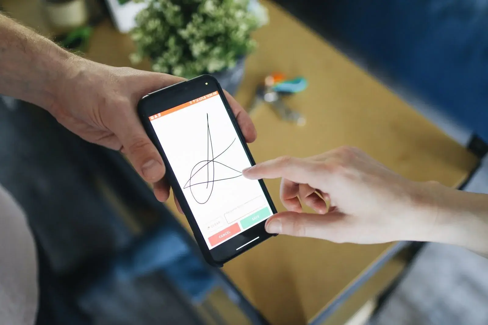
Your visitor has taken the time to write. If they click and nothing seems to happen, they may send their message again or leave thinking it hasn’t worked. A clear confirmation tells them their enquiry has been received and what they can expect next.
On your side, the message still needs to reach the right place. An email notification may be all you need; as enquiries increase, a tracking tool or a connection to your calendar can help. The important thing is to know who receives the enquiry and who deals with it.
I recommend carrying out a real end-to-end test regularly: fill in the form, check the confirmation, then find the message you received and make sure all its information is there. A screen saying “message sent” does not, on its own, prove that anyone has actually received it.
The worst situation I’ve seen is when customers try to reach you, but their messages never arrive. An incorrect email address, a broken process, enquiries ending up in spam… and you don’t even know these people tried to contact you.
What should you check if enquiries aren’t coming in?
A hard-to-find or complicated form is just one possible explanation. The page leading to it may promise something else; the visitor may not know whether you cover their area; or a field may be causing problems on mobile. Look at the whole journey before concluding that nobody is interested in your website.
Depending on the tools available to you, and in line with applicable rules, you can track page visits, successful submissions, errors and the number of enquiries you can actually act on. Visits aren’t enquiries: comparing the different stages helps you identify where to look. The article on website statistics can help you understand these signals.
Ultimately, a good form doesn’t try to replace your first conversation. It encourages people to start one and gives you the information you need to respond. Start by removing an unnecessary question, making the next steps clear and checking that the enquiry really arrives: that’s already a solid foundation.